



Conversion-first design treats your website as a sales asset instead of a digital brochure. In other words, every page must earn its place by moving a visitor one step closer to an enquiry. For European SMEs that shift matters, because traffic is expensive and attention is short. Therefore this guide gives you the principles, the page-by-page checklist and the 30-day plan you need.
You do not need a full rebuild to start. In fact, most of the gains come from decisions you can make this quarter with your current site.
Why most SME websites still sell nothing
Most SME websites were built to describe a company. As a result, they read like a company profile: who we are, what we do, where we sit. However, buyers do not arrive to read a profile. They arrive with a question, a budget and a deadline.
Because of that gap, traffic converts poorly. The site looks professional, yet enquiries stay flat. Meanwhile the ad budget grows, and the team blames the channel instead of the destination.
Abandonment data tells the same story. For example, Baymard Institute puts the average online shopping cart abandonment rate at 70.22%, averaged across 50 studies. B2B enquiry forms are not identical. Still, the lesson carries: people leave when a page asks for more than it gives.
Three patterns appear again and again in SME audits. First, the homepage describes the company instead of the customer. Second, the service pages stop at a feature list, so the buyer never sees an outcome. Third, the contact form asks for a phone number, a company size and a budget range before any trust exists.
None of these problems need a new visual identity. Rather, they need a different starting question.
What conversion-first design actually means
Conversion-first design means you choose the desired action before you choose the layout. First you name the action. Then you build the shortest honest path towards it.
This is not aggressive selling. Instead, it is clarity. A visitor should know within seconds what you do, who you serve and what happens next. So every page starts with one sentence: “After reading this, the visitor should ___.”
If you have followed this series, you already hold the inputs. Your ideal customer profile tells you who the page is for. Your positioning and value proposition tells you what to promise. Conversion-first design simply puts those decisions on the screen.
The five principles of conversion-first design
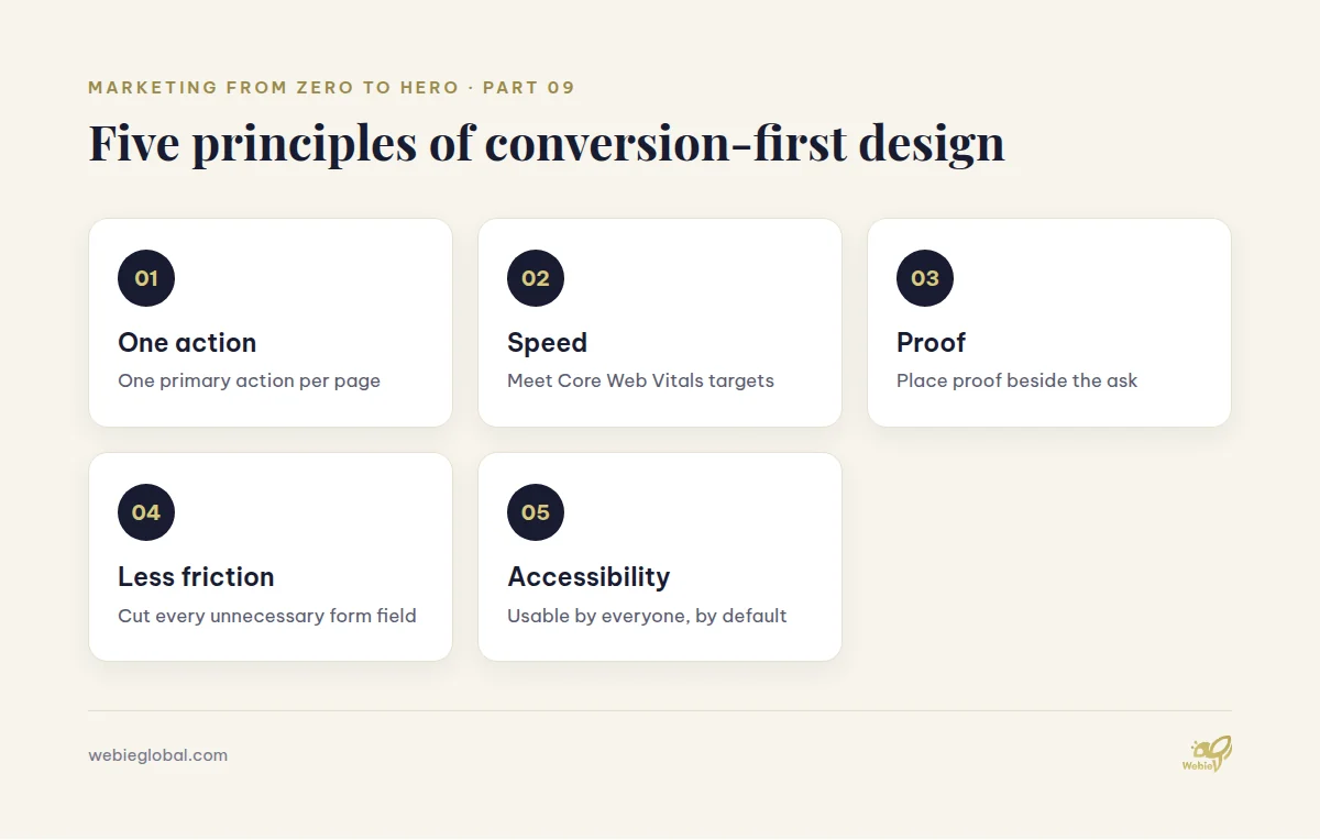
These five principles apply to a one-page site and to a 300-page platform. Therefore treat them as a checklist, not a theory.
One primary action per page
Every page gets one primary action. Secondary links may exist, but they look secondary. For example, a service page leads to “Book a scoping call” while the case-study link sits below as a quiet alternative.
When a page offers five equal buttons, visitors pick none. So remove options rather than adding them. This single rule often lifts enquiries before any visual change.
Speed is part of conversion-first design
A slow page loses buyers before your copy appears. Because of that, performance belongs in the design brief, not in a later ticket.
Google publishes clear targets in its Core Web Vitals documentation: Largest Contentful Paint within 2.5 seconds, Interaction to Next Paint at 200 milliseconds or less, and Cumulative Layout Shift of 0.1 or less, measured at the 75th percentile of page loads. Consequently, hero videos, carousels and heavy sliders deserve hard scrutiny.
Proof before the ask
People commit after they believe you. So place proof next to the request, not on a separate page. Client logos, a named testimonial, a short result summary or a certification all work.
Never invent proof. If you have no case studies yet, publish your process instead. In practice, a transparent method reassures European buyers as much as a logo wall.
Friction audit on every form
Each extra field costs you enquiries. First, list every field. Then ask what your sales team truly needs in the first reply. Usually the answer is name, work email and one context line.
In addition, explain what happens after submission. “We reply within one working day” reduces hesitation at almost no cost.
Accessibility is conversion-first design
Accessible pages convert better because they are easier for everyone to use. Furthermore, they are now a legal matter in Europe. The European Accessibility Act covers services the EU considers essential, and e-commerce appears explicitly on that list.
Consequently, contrast, keyboard navigation, form labels and readable text sizes are not optional polish. Check your own obligations with a local adviser, since national implementations differ.
A page-by-page conversion-first design checklist
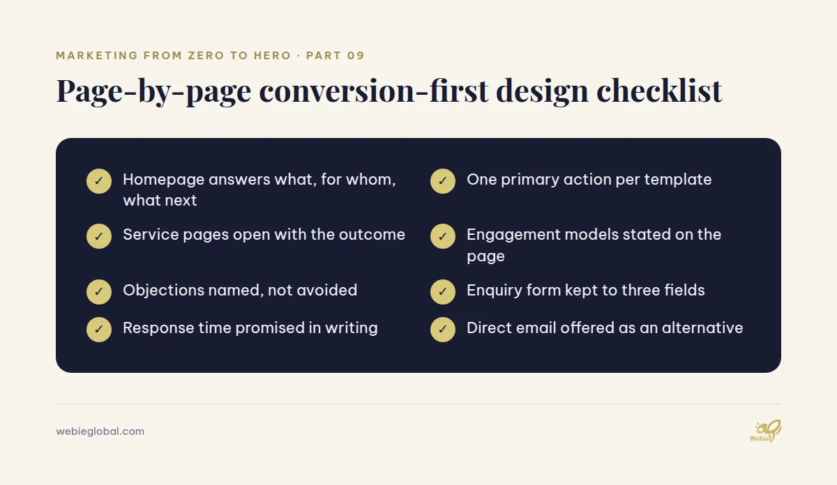
Use this checklist per template rather than per page. As a result, one fix improves dozens of URLs at once.
Homepage
The homepage answers three questions above the fold: what you do, for whom and what to do next. Then it routes visitors by need, not by your org chart.
Because homepage traffic is mixed, keep one primary action and two clear routes. For example: “Book a call”, “See services”, “Read insights”.
Service pages
Service pages carry the commercial weight. So open with the outcome, follow with scope, then explain your engagement models. Fixed-price, retainer and time-and-materials options answer budget questions early.
Additionally, name the objections. Timeline, team seniority, communication and data handling all belong on the page, because silence reads as risk.
Contact and enquiry pages
Keep one form, one promise and one alternative. The promise is a response time. The alternative is a direct email, such as huyen.dang@webieglobal.com, for buyers who dislike forms.
Moreover, avoid captchas that punish real users. If spam rises, filter on the server side instead.
How to measure conversion-first design
Design without measurement is decoration. Therefore agree the metrics before the first change ships.
| Metric | What it tells you | Review rhythm |
|---|---|---|
| Enquiry conversion rate | Whether the page persuades | Weekly |
| Form completion rate | Where friction sits | Weekly |
| Scroll depth to CTA | Whether the layout delivers the ask | Monthly |
| Core Web Vitals pass rate | Whether speed blocks conversion | Monthly |
| Qualified enquiry share | Whether you attract the right buyers | Monthly |
Your marketing goals and KPIs should already define targets. Consequently, you only need to connect page-level numbers to those targets.
Track consent-compliant analytics from the start. Our guide to GDPR-compliant marketing explains the constraints, while the article on building your marketing tech stack covers the tooling.
Three mistakes that undo conversion-first design
Teams rarely fail on effort. Instead, they fail on a few predictable habits.
The first mistake is designing for internal approval. When every department adds a banner, the page loses its single action. Therefore agree the primary action with stakeholders before the first draft, not after.
The second mistake is copying a competitor’s layout. Your competitor analysis should inform your positioning, yet it cannot tell you which of their pages actually converts. So test the idea on your own audience instead of assuming.
The third mistake is stopping after launch. Conversion-first design depends on iteration, because the first version is only a hypothesis. As a result, teams that review monthly keep improving, while teams that ship once drift back to the old numbers.
A 30-day rollout plan
Small teams do not need a year. In fact, four focused weeks usually produce measurable movement.
- Week 1 — Baseline. Record current conversion rates, form drop-off and Core Web Vitals. Also list every template.
- Week 2 — Clarity. Rewrite headlines, set one primary action per template and move proof beside each ask.
- Week 3 — Friction. Cut form fields, fix labels, add response promises and repair accessibility issues.
- Week 4 — Speed and review. Remove heavy assets, compress images, then compare results against week one.
Afterwards, repeat the cycle on your next-highest-traffic template. Because compounding beats perfection, a steady monthly rhythm outperforms a single redesign.
FAQ about conversion-first design
How long does conversion-first design take?
A first pass takes about four weeks for a small site. However, the measurement cycle never really ends, since buyer expectations keep moving.
Does conversion-first design require a full redesign?
No. Conversion-first design usually starts with copy, hierarchy and forms. Therefore most SMEs see results before any rebuild begins.
Which metrics prove conversion-first design works?
Enquiry conversion rate and qualified enquiry share matter most. In addition, form completion rate shows exactly where visitors hesitate.
Can a small marketing team run conversion-first design alone?
Yes, for copy and structure. For performance, accessibility and development work, though, most teams add specialist support.
How does conversion-first design affect SEO?
Positively, in general. Because speed, clarity and accessibility all help users, they also support the signals search engines reward.
Turn your website into a sales asset
Conversion-first design is a discipline rather than a project. So if your site attracts visitors but few enquiries, the fix is usually structural, not cosmetic.
Webie Global builds and improves conversion-focused websites for European SMEs, with dedicated teams, clear processes and GDPR-aware delivery. You can review our services or email huyen.dang@webieglobal.com to discuss your current site.
Series navigation: this is part 9 of “Marketing from Zero to Hero”. Previously: Building Your Marketing Tech Stack. Next: Technical SEO Basics for Business Websites.